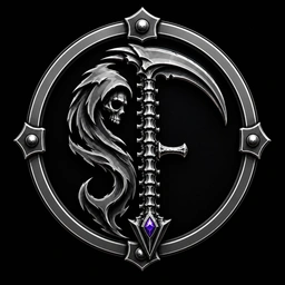
The myth of logo design is that icons emerge fully formed from the void. Designers put on a sleek black turtleneck, draw three minimalist circles on a napkin, and hand down a pristine vector. The reality of building a brand identity in the era of hybrid human-AI collaboration is much more like arguing with an image model about the physical anatomy of a scythe at 2:00 AM.
The Anatomy Problem
When you ask a generative image model for a "glowing ceremonial hammer merged with a rune shield" or "mythpunk scythe iconography," image models frequently synthesize physically impossible geometry: double-headed scythes with three handles, floating geometric paradoxes, and hammers that look like glowing fantasy popsicles. It takes dozens of precise prompt corrections, mask refinements, and vector extractions to force the model to respect real-world silhouette principles.
Human: "Make a scythe."
Model: "Certainly. Here's a spoon with aspirations."
Human: "No, a REAL scythe."
Model: "Excellent. Four blades. Two handles."
Human: "ONE HANDLE."
Model: "Understood. Six elbows."
Human: "The gemstone goes at the BASE."
Model: "You mean... the middle?"
If you think AI-assisted brand design is just typing prompts, you have never spent three hours explaining basic scythe anatomy to a stochastic parrot.
The Iteration Trail
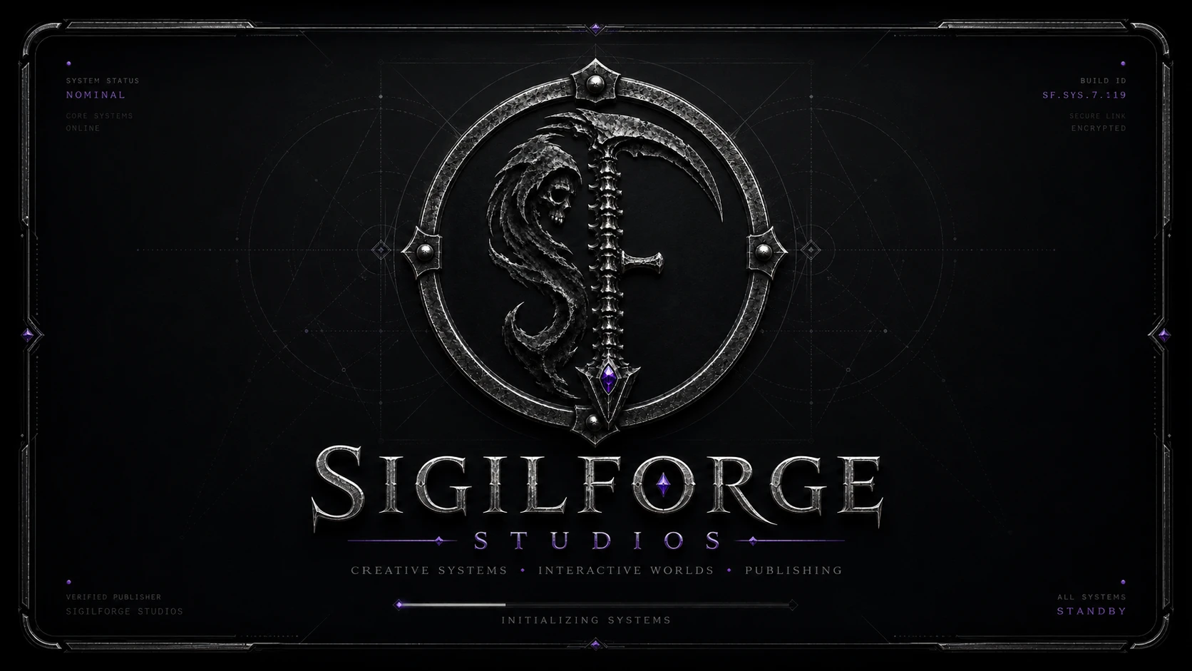
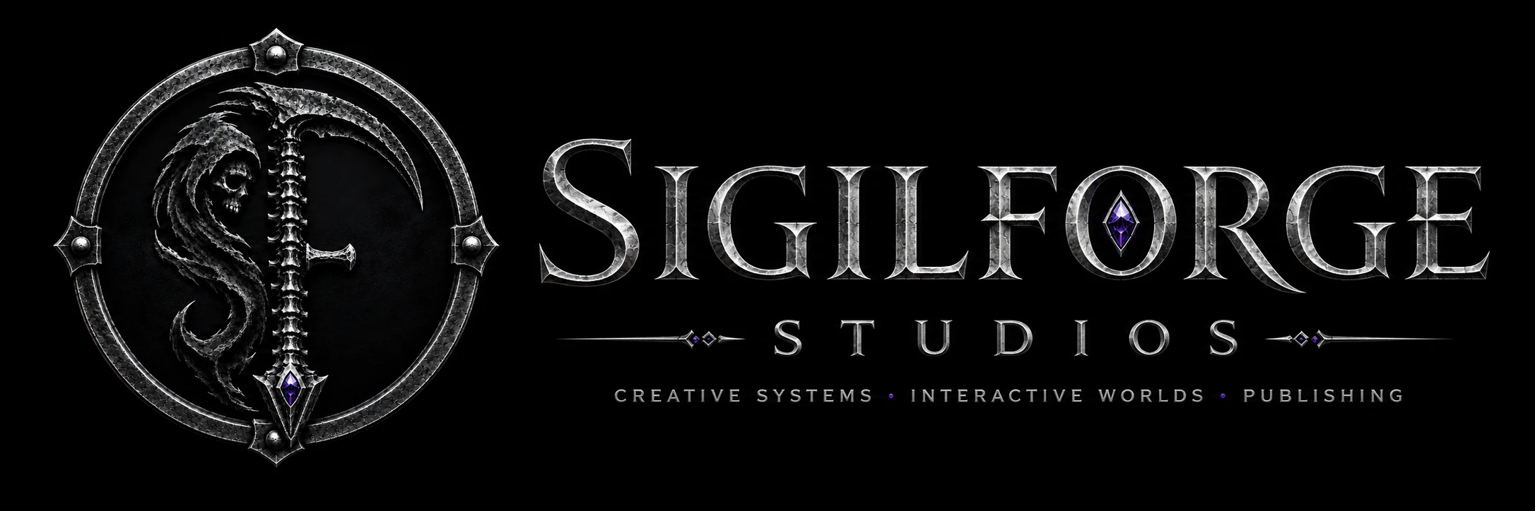
Across 147 raw image generations, prompt variations, and color preset explorations, the visual identity of SigilForge Studios was forged out of raw ore:
- Attempts 1–40: Overly ornate medieval fantasy shields that looked like generic TTRPG game icons rather than a modern tech-publishing studio.
- Attempts 41–90: Hyper-futuristic cyberpunk neon badges that lacked the tactile, physical warmth of tabletop publishing.
- Attempts 91–130: Dialing in the balance of obsidian velvet depth (`#120624`), VeilCorp purple (`#9A3CFF`), neon cyan (`#00F0FF`), and glowing magenta accents (`#D845FF`).
- Attempts 131–147: Extracting the clean vector geometry of the SigilForge Shield Emblem, establishing the formal 1:1 square badge lockups, and compiling the official Brand Board.

Iteration Gallery: Plates & Emblem Studies
Internal Identity vs. External Deliverables
One of the most useful lessons in brand architecture is separating internal design artifacts from public press deliverables:
A Brand Board is an internal compass—it documents the visual exploration, prompt philosophy, and color harmony rules used to build the studio. A Press Room, on the other hand, is built for external partners, journalists, and developers who need instant access to finished vector SVG files, monochrome lockups, transparent PNGs, and crisp product screenshots.
By giving our internal Brand Guidelines their own formal surface at /studio/brand/, and keeping the Press Room focused strictly on high-performance deliverables at /studio/press/, every audience gets exactly what they need—without wading through 147 attempts at scythe anatomy.
And even after 147 candidate generations, prompt engineering, and automated WebP build scripts, the creative director is still sitting in GIMP at the end of the night manually tweaking alpha channels, extracting paths, and perfecting edge contrast. Machine intelligence generates raw ore; human craft finishes the blade.